


When using an application, the smooth movement of objects, pages, modals, and other components improves our UX and encourages users to return. No one wants to use an app that glitches and does not move properly.
Creating animations and object transitions might be a burden for frontend developers since we typically want to focus on writing code for our application and not bother calculating where to place an object or where to move that object when a user hits an event on our application.
Working with UI designers can also be a challenge, especially when
expectations are misaligned — for example, when designers expect to see
their complex animations recreated as-is. Finding a good tool and
package to solve this issue is not so easy, either — but that is exactly
why the react-native-reanimated package was built.
The react-native-reanimated
npm package allows us to easily create both simple and complex, yet
smooth and interactive animations. It might not be intuitive to use at
first, but as we practice with the examples in this article, we should
get a good idea of how to use the package.
Before we continue, I’m assuming you already have a knowledge of React Native and how it works. Also, React Native Reanimated v3 only supports React Native v0.64 or newer, so ensure you update or download the latest version of React Native to work with this tutorial.
Exploring React Native Reanimated v2
If you have ever used React Native Reanimated v1, keep in mind that v2 introduced some new concepts and breaking changes. Let’s explore some of these changes now.
Name changes
The breaking changes in Reanimated 2 include some name changes to keep in mind. For example, the interpolate method is now interpolateNode, while the Easing method is now EasingNode.
Worklets
In React Native Reanimated v2, animations are first-class citizens. Animations are written in pure JS in the form of worklets.
Worklets are pieces of JavaScript code that are picked from the main React Native code by the Reanimated Babel plugin. These pieces of code run in a separate thread using a separate JavaScript virtual machine context and are executed synchronously on the UI thread.
To create a worklet, you will explicitly add the worklet directive on top of your function. See the code below:
function someWorklet(greeting) {
  'worklet';
  console.log("Hey I'm running on the UI thread");
}
All the functions with the worklet
directive are picked and run in a separate JavaScript thread. You can
also run your function in the UI thread by calling or executing the
function using runOnUI like so:
function FirstWorklet(greeting) {
  'worklet';
  console.log("Hey I'm running on the UI thread");
}

function secondFunction() {
  console.log("Hello World!");
}

function onPress() {
  runOnUI(secondFunction)();
}
In the code above, FirstWorklet
is the only worklet function, so it will be picked by the Reanimated
Babel plugin and run in a separate thread. Meanwhile, the other
functions will run synchronously in the main JavaScript thread.
Shared Values
In Reanimated, Shared Values are primitive values that are written on the JavaScript side but are used to drive animations on the UI thread.
As we learned while exploring worklets, Reanimated runs our animation in a separate thread using a separate JavaScript virtual machine context. When we create a value in our main thread or in our JavaScript, Shared Values maintains a reference to that mutable value.
Since it is mutable, we can make changes to the Shared Value and see the referenced changes in the UI thread, along with a change in our animation.
See the code below:
import React from 'react';
import {Button, View} from 'react-native';
import {useSharedValue} from 'react-native-reanimated';

function App() {
  const sharedValue = useSharedValue(0);

  return (
    <View>
      <Button title="Increase Shared Value" onPress={() => (sharedValue.value += 1)} />
    </View>
  );
}
As we can see in our code above, Shared Value objects serve as
references to pieces of shared data that can be accessed using their .value property. Therefore, to access and modify our shared data, use the .value property as seen above.
We use the useSharedValue hooks to create and store data in our Shared Value references.
The useAnimatedStyle Hook
The useAnimatedStyle Hook allows us to create an association between Shared Values and View properties to animate our View stylings using the Shared Values.
Let’s look at the code below:
import { useAnimatedStyle } from 'react-native-reanimated';

const Animation = useAnimatedStyle(() => {
    return {
     ...style animation code
    };
  });
The useAnimatedStyle Hook returns our updated animation styling, gets the Shared Value, and then executes the updates and the styles.
Just like the useEffect Hook, the useAnimatedStyle
Hook accepts a dependency. When the dependency is omitted as we did
above, the update is called only when there’s a change in the body.
If the dependency is included, however, the useAnimatedStyle Hook runs the update whenever there’s a change in the dependency value, like so:
import { useAnimatedStyle } from 'react-native-reanimated';

const Animation = useAnimatedStyle(() => {
    return {
     ...style animation code
    };
  }, [ dependency] );
Using new React Native Reanimated concepts
Now that we have explored some of the new concepts introduced in React Native Reanimated v2, we will now use them to create animations in our application with these new concepts.
To use the React Native Reanimated library, we will have to install the library first. Run either of the commands below to install the package:
// yarn
yarn add react-native-reanimated

// npm
npm i react-native-reanimated --save
Next, go into your babel.config.js file and add the plugin as shown below:
module.exports = {
    presets: [
      ...
    ],
    plugins: [
      ...
      'react-native-reanimated/plugin',
    ],
  };
Note that the React Native Reanimated plugin has to be added last.
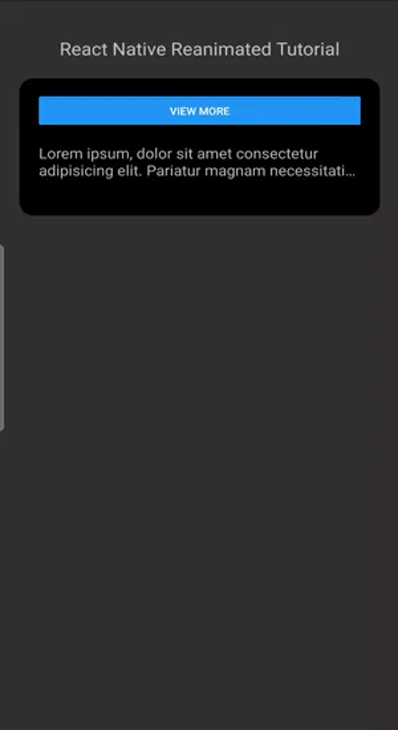
Next, in your App.js file, let’s create a simple page with some header and body content:
import React from 'react';
import {View, Button, Text, StyleSheet} from 'react-native';
const App = () => {
  return (
    <View style={styles.parent}>
      <Text style={styles.header}>React Native Reanimated Tutorial</Text>
      <View style={styles.box}>
        <Button title="View more" />
        <View style={{marginTop: 20}}>
          <Text style={styles.textBody}>
            Lorem ipsum, dolor sit amet consectetur adipisicing elit. Pariatur
            magnam necessitatibus dolores qui sunt? Mollitia nostrum placeat
            esse commodi modi quaerat, et alias minima, eligendi ipsa
            perspiciatis, totam quod dolorum.
            {'\n'}
            {'\n'}
            Lorem ipsum, dolor sit amet consectetur adipisicing elit. Pariatur
            magnam necessitatibus dolores qui sunt? Mollitia nostrum placeat
            esse commodi modi quaerat, et alias minima, eligendi ipsa
            perspiciatis, totam quod dolorum.
          </Text>
        </View>
      </View>
    </View>
  );
};
export default App;
const styles = StyleSheet.create({
  parent: {
    flex: 1,
    paddingTop: 40,
    paddingHorizontal: 20,
  },
  header: {
    fontSize: 24,
    marginBottom: 20,
    textAlign: 'center',
  },
  box: {
    backgroundColor: '#000',
    borderRadius: 15,
    padding: 20,
  },
  textBody: {
    fontSize: 20,
    marginBottom: 20,
  },
});
The goal is to create animated dropdown text that will display when we click a button:
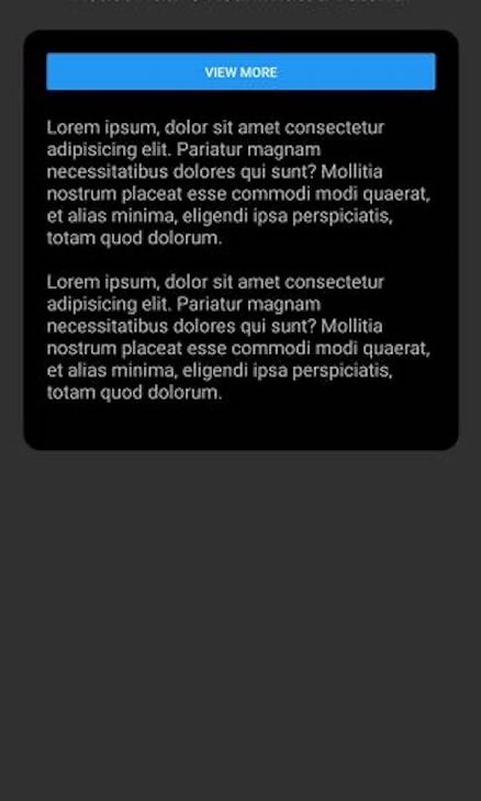
Let’s achieve our desired animation with the useAnimatedStyle Hook and Shared Values, as shown below:
import React, {useState} from 'react';
import {View, Button, Text, StyleSheet} from 'react-native';
import Animated, {
  useAnimatedStyle,
  useSharedValue,
  withTiming,
} from 'react-native-reanimated';
const App = () => {
  const boxHeight = useSharedValue(60);
  const [maxLines, setMaxLines] = useState(2);

  const truncatedAnimation = useAnimatedStyle(() => {
    return {
      height: withTiming(boxHeight.value, {duration: 1000}),
    };
  }, []);

  function showText() {
    setTimeout(() => {
      maxLines === 2 ? setMaxLines(0) : setMaxLines(2);
    }, 400);
    boxHeight.value === 60 ? (boxHeight.value = 150) : (boxHeight.value = 60);
  }

  return (
    <View style={styles.parent}>
      <Text style={styles.header}>React Native Reanimated Tutorial</Text>
      <View style={styles.box}>
        <Button
          title={maxLines === 2 ? 'View more' : 'Close Dropdown'}
          onPress={showText}
        />
        <Animated.View style={[{marginTop: 20}, truncatedAnimation]}>
          <Text style={styles.textBody} numberOfLines={maxLines}>
            Lorem ipsum, dolor sit amet consectetur adipisicing elit. Pariatur
            magnam necessitatibus dolores qui sunt? Mollitia nostrum placeat
            esse commodi modi quaerat, et alias minima, eligendi ipsa
            perspiciatis, totam quod dolorum.
            {'\n'}
            {'\n'}
            Lorem ipsum, dolor sit amet consectetur adipisicing elit. Pariatur
            magnam necessitatibus dolores qui sunt? Mollitia nostrum placeat
            esse commodi modi quaerat, et alias minima, eligendi ipsa
            perspiciatis, totam quod dolorum.
          </Text>
        </Animated.View>
      </View>
    </View>
  );
};
export default App;
const styles = StyleSheet.create({
  parent: {
    flex: 1,
    paddingTop: 40,
    paddingHorizontal: 20,
  },
  header: {
    fontSize: 24,
    marginBottom: 20,
    textAlign: 'center',
  },
  box: {
    backgroundColor: '#000',
    borderRadius: 15,
    padding: 20,
  },
  textBody: {
    fontSize: 20,
    marginBottom: 20,
  },
});
In our code above, we first imported our react-native-reanimated package. Next, we used the Animated options for our View — which we imported from react-native-reanimated — to wrap the view that we want to animate.
After that, we set our box’s initial height to 60 using useSharedValue. We also have a maxLines state that we’re setting to 2. The maxLines state determines the number of lines to which we are truncating our text, which in this case is a maximum of 2 lines.
The showText function checks if the height is 60 when the button is clicked, and if so, it increases the height to 150. If the height is already 150, it will decrease to 60 when the button is clicked instead.
We are also setting the maxLines state to 0, meaning we want the full text to be shown when we click on our “View more” button.
With the useAnimatedStyle Hook, we created our animation association between our shared value and the View that we’re animating.
You can see the result below:
Introducing a new feature in React Native Reanimated v3
React Native Reanimated v3 does not introduce any breaking changes, as was the case in v2. Hence, every code written in v2 will work fine in v3. However, an additional feature was introduced, which we will look at extensively. This feature is called Shared Element Transitions.
Understanding Shared Element Transitions
This new feature introduced in v3 is a transition feature that allows you to animate views between navigation screens. sharedTransitionTag is the attribute that allows us to animate our screens between navigations.
To create a shared transition animation between screens, simply assign the same sharedTransitionTag to both components. When you navigate between screens, the shared transition animation will automatically play.
To see how it works, we will be animating an image screen.
First, create four files — ImageDescription.js, Home.js, SharedElements.js, and our root file, App.js. Copy and paste the relevant code for each file as shown below.
In your App.js file:
import * as React from 'react';
import {NavigationContainer} from '@react-navigation/native';
import {createNativeStackNavigator} from '@react-navigation/native-stack';
import Home from './src/Home';
import ImageDescription from './src/ImageDescription';
const Stack = createNativeStackNavigator();
function App() {
  return (
    <NavigationContainer>
      <Stack.Navigator initialRouteName="Home">
        <Stack.Screen
          name="Home"
          component={Home}
          options={{
            title: 'Posts',
            headerTintColor: '#000',
            headerTitleAlign: 'center',
            headerTitleStyle: {
              fontWeight: 'bold',
            },
          }}
        />
        <Stack.Screen
          name="ImageDescription"
          component={ImageDescription}
          options={{
            title: 'Image',
            headerTintColor: '#000',
            headerTitleAlign: 'center',
            headerTitleStyle: {
              fontWeight: 'bold',
            },
          }}
        />
      </Stack.Navigator>
    </NavigationContainer>
  );
}
export default App;
The App.js file houses our navigation components. We have two screens — the Home and ImageDescription screens. We are also customizing our navigation header here to our preferred stylings.
Next, in your Home.js file:
import React from 'react';
import {
Image,
StyleSheet,
Dimensions,
SafeAreaView,
TouchableOpacity,
} from 'react-native';
import Animated from 'react-native-reanimated';
import {sharedElementTransition} from './SharedElements';
import Img1 from '../assets/image1.jpg';
import Img2 from '../assets/image2.jpg';
import Img3 from '../assets/image3.jpg';
import Img4 from '../assets/image4.jpg';
const imageArray = [
{
id: 1,
img: Img1,
description: `Image 1. To create a shared transition animation between two components on different screens, simply assign the same sharedTransitionTag to both components. When you navigate between screens, the shared transition animation will automatically play. The shared transition feature works by searching for two components that have been registered with the same sharedTransitionTag. If you want to use more than one shared view on the same screen, be sure to assign a unique shared tag to each component.`,
},
{
id: 2,
img: Img2,
description: `Image 2. "Neque porro quisquam est qui dolorem ipsum quia dolor sit amet, consectetur, adipisci velit..."
"There is no one who loves pain itself, who seeks after it and wants to have it, simply because it is pain..."
`,
},
{
id: 3,
img: Img3,
description: `Image 3. "Neque porro quisquam est qui dolorem ipsum quia dolor sit amet, consectetur, adipisci velit..."
"There is no one who loves pain itself, who seeks after it and wants to have it, simply because it is pain..."
`,
},
{
id: 4,
img: Img4,
description: `Image 4. "Neque porro quisquam est qui dolorem ipsum quia dolor sit amet, consectetur, adipisci velit..."
"There is no one who loves pain itself, who seeks after it and wants to have it, simply because it is pain..."
`,
},
{
id: 5,
img: Img3,
description: `Image 5. "Neque porro quisquam est qui dolorem ipsum quia dolor sit amet, consectetur, adipisci velit..."
"There is no one who loves pain itself, who seeks after it and wants to have it, simply because it is pain..."
`,
},
{
id: 8,
img: Img2,
description: `Image 8. "Neque porro quisquam est qui dolorem ipsum quia dolor sit amet, consectetur, adipisci velit..."
"There is no one who loves pain itself, who seeks after it and wants to have it, simply because it is pain..."
`,
},
{
id: 7,
img: Img1,
description: `Image 7. "Neque porro quisquam est qui dolorem ipsum quia dolor sit amet, consectetur, adipisci velit..."
"There is no one who loves pain itself, who seeks after it and wants to have it, simply because it is pain..."
`,
},
{
id: 6,
img: Img4,
description: `Image 6. "Neque porro quisquam est qui dolorem ipsum quia dolor sit amet, consectetur, adipisci velit..."
"There is no one who loves pain itself, who seeks after it and wants to have it, simply because it is pain..."
`,
},
];
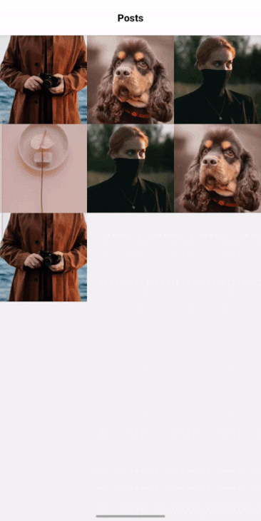
export default function Home({navigation}) {
return (
<SafeAreaView style={styles.container}>
{imageArray.map(image => (
<TouchableOpacity
key={image.id}
onPress={() =>
navigation.navigate('ImageDescription', {
image: image,
})
}>
<Animated.View
style={styles.imageContainer}
sharedTransitionTag="animateImageTag"
sharedTransitionStyle={sharedElementTransition}>
<Image source={image.img} style={styles.image} />
</Animated.View>
</TouchableOpacity>
))}
</SafeAreaView>
);
}
const windowWidth = Dimensions.get('window').width;
const styles = StyleSheet.create({
container: {
flex: 1,
flexWrap: 'wrap',
flexDirection: 'row',
alignItems: 'center',
},
imageContainer: {
height: 140,
width: windowWidth / 3,
},
image: {
flex: 1,
resizeMode: 'cover',
width: '100%',
},
});
In the Home component, we have some images that we are mapping and displaying on our screen, like so:

When an image is clicked, it navigates the user to another screen — the ImageDescription component — that shows the image clicked, a header title, and a description underneath the image, like so:

To set this component up, copy the below into your ImageDescription.js file:
import React from 'react';
import Animated from 'react-native-reanimated';
import {sharedElementTransition} from './SharedElements';
import {View, Text, StyleSheet, Image, Dimensions} from 'react-native';
export default function ImageDescription({route}) {
  const {image} = route.params;
  return (
    <View style={styles.container}>
      <Text style={styles.title}>Shared Elements Transition</Text>
      <Animated.View
        style={styles.imageContainer}
        sharedTransitionTag="animateImageTag"
        sharedTransitionStyle={sharedElementTransition}>
        <Image source={image.img} style={styles.image} />
      </Animated.View>
      <Text style={styles.description}>{image.description}</Text>
    </View>
  );
}
const windowWidth = Dimensions.get('window').width;
const styles = StyleSheet.create({
  container: {
    flex: 1,
  },
  title: {
    fontSize: 24,
    fontWeight: 'bold',
    color: '#000',
    marginHorizontal: 10,
    marginVertical: 5,
  },
  imageContainer: {
    height: 500,
    width: windowWidth,
  },
  image: {
    height: '100%',
    width: '100%',
  },
  description: {
    fontSize: 20,
    color: '#000',
    marginHorizontal: 10,
    marginVertical: 5,
  },
});
Next, we’ll introduce our Animated View from react-native-reanimated. The Animated View is wrapped around the section you want to animate and in our case, the images. Animated.View takes some options like the sharedTransitionTag and the sharedTransitionStyle.
Add the below to your SharedElements.js file:
import {SharedTransition, withSpring} from 'react-native-reanimated';
const CONFIG = {
  mass: 1,
  stiffness: 100,
  damping: 200,
};

export const sharedElementTransition = SharedTransition.custom(values => {
  'worklet';
  return {
    height: withSpring(values.currentHeight, CONFIG),
    width: withSpring(values.currentWidth, CONFIG),
    originX: withSpring(values.currentOriginX, CONFIG),
    originY: withSpring(values.currentOriginY, CONFIG),
  };
});
In the code above, the sharedTransitionTag lets Reanimated detect the components to animate. So, components with the same sharedTransitionTag share the animation between them.
Meanwhile, sharedTransitionStyle allows you to write custom stylings for the height, width, originY, and originX of the animated components.
The complete app will look like this:
Conclusion
We have learned about changes introduced in React Native Reanimated v2 and v3, the core features, and how to use these core features. We have also seen how to create smooth transitions and animations using the concepts we have learned in the article.
The Share Elements Transition feature is still experimental, which means that a more stable version is being worked on. In the meantime, you can use it and see how it works, although you may not want to use it in production yet.


No comments:
Post a Comment