


Tailwind CSS is a utility-first CSS framework that lets you build modern websites without ever leaving your HTML. It's fast, flexible, and reliable — with zero-runtime.
In this tutorial, you will learn how to install Tailwind CSS, how to use its utility classes to style your elements, how to make your website responsive and dark mode compatible, and how to customize and reuse your styles.
Are you ready to get started?

If you prefer video, check it out here:
What is Tailwind?
Tailwind CSS gives you a lot of flexibility and control over your styles by providing you with utility classes that can be composed to create any design.
To use Tailwind CSS, you need to install it via npm, create a tailwind.config.js file, configure your template paths, add the @tailwind directives to your CSS file, and run the Tailwind CLI tool to generate your output CSS file. You can also use other tools like PostCSS, webpack, or Gulp to integrate Tailwind CSS into your workflow.
Once you have your output CSS file ready, you can link it to your HTML file and start using the utility classes in your markup. For example, if you want to create a heading with a large font size, a bold font weight, and an underline style, you can use the following classes:
<h1 class="text-3xl font-bold underline">Hello world!</h1>
You can also use responsive modifiers to make your website adapt to different screen sizes. For example, if you want to change the font size of the heading on small screens, you can use the sm: prefix:
<h1 class="text-3xl sm:text-4xl font-bold underline">Hello world!</h1>
This will make the font size 4xl on screens that are at least 640px wide.
Now that you know that what Tailwind CSS is, let’s explore how you can use it.
Tailwind Basics: How does it work?
As we said before Tailwind CSS offers all types of styles as utility classes.
Here’s a quick explanation of how it works and how to use it.
The Text Styles
You can style the text with Tailwind CSS classes, you can increase the font sizes, change the colors, change the font weight, and all the styles you can add with vanilla CSS.
Here’s a quick example of a text styled with Tailwind CSS
<h1 class="text-3xl font-bold">Thomas</h1>
This text has a font size of 1.8rem and a font weight of bold.
Adding Spacing
It’s very easy to add spacing with Tailwind CSS. You can add margin, padding and border with Tailwind.
For padding you have to use the p class, after that, you have to prefix the side you want to add the padding to.
Here’s an example
<div class="pr-5"> Test </div>
This div has a padding-right of 5, this way you can add padding or margin to all the sides.
You can learn more on Tailwind CSS docs.
Now that you got an idea of how Tailwind CSS works let’s move on and build a simple social link project.
Build a Social Link Project
We are going to build a simple social link project. In the end it’ll look like this:
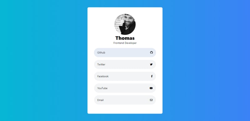
It’s a simple project that includes all the social links and a short description of a developer. 😊
To get started, first of all we will have to setup a Tailwind CSS project with HTML.
You can follow this tutorial to setup a Tailwind CSS project.
So, the project setup is done. Now we are going to start building the project.
We’ll start out by writing the HTML.
The Html
The HTML here includes Fontawesome CDN link and the compiled stylesheet we got after running the build command.
After that, we got the Card Header which includes an avatar and a short description of the person.
And after that we got all the social links. The social links has an icon and a name.
<!DOCTYPE html>
<html lang="en">
  <head>
    <meta charset="UTF-8" />
    <meta http-equiv="X-UA-Compatible" content="IE=edge" />
    <meta name="viewport" content="width=device-width, initial-scale=1.0" />
    <title>Social Links</title>
    <link
      rel="stylesheet"
      href="https://cdnjs.cloudflare.com/ajax/libs/font-awesome/6.4.0/css/all.min.css"
      integrity="sha512-iecdLmaskl7CVkqkXNQ/ZH/XLlvWZOJyj7Yy7tcenmpD1ypASozpmT/E0iPtmFIB46ZmdtAc9eNBvH0H/ZpiBw=="
      crossorigin="anonymous"
      referrerpolicy="no-referrer"
    />
    <link rel="stylesheet" href="./dist/output.css" />
  </head>
  <body>
    <div class="">
      <div class="card">
        <div class="card-header">
          <img
            src="https://cloudflare-ipfs.com/ipfs/Qmd3W5DuhgHirLHGVixi6V76LhCkZUz6pnFt5AJBiyvHye/avatar/279.jpg"
            alt=""
            class=""
          />
          <h1 class="">Thomas</h1>
          <p>Frontend Developer</p>
        </div>
        <div class="card-links">
          <div class="card-item">
            <p class="name">Github</p>
            <div class="icon">
              <i class="fa-brands fa-github"></i>
            </div>
          </div>
          <div class="card-item">
            <p class="name">Twitter</p>
            <div class="icon">
              <i class="fa-brands fa-twitter"></i>
            </div>
          </div>
          <div class="card-item">
            <p class="name">Facebook</p>
            <div class="icon">
              <i class="fa-brands fa-facebook-f"></i>
            </div>
          </div>
          <div class="card-item">
            <p class="name">YouTube</p>
            <div class="icon">
              <i class="fa-brands fa-youtube"></i>
            </div>
          </div>
          <div class="card-item">
            <p class="name">Email</p>
            <div class="icon">
              <i class="fa-regular fa-envelope"></i>
            </div>
          </div>
        </div>
      </div>
    </div>
  </body>
</html>
So the markup is done, let’s go ahead and add the stylings.
The Styles
We will start out by adding the background color to the body. Which we will add using the Tailwind CSS @apply directive.
Add this to your styles.css file.
body {
    @apply bg-gradient-to-r from-cyan-500 to-blue-500;
}
After adding the background color we’ll center the card horizontally and vertically. And then we style the card header.
<div class="flex justify-center items-center h-screen">
    <div class="card bg-white p-10 rounded-lg w-[30%]">
       <div class="card-header text-center pb-5">
         <img
            src="https://cloudflare-ipfs.com/ipfs/Qmd3W5DuhgHirLHGVixi6V76LhCkZUz6pnFt5AJBiyvHye/avatar/279.jpg"
            alt="image avatar"
            class="rounded-full m-auto"/>
         <h1 class="text-3xl font-bold ">Thomas</h1>
         <p>Frontend Developer</p>
     </div>
</div>
Here we styled the card links. It’s not some fancy design, we just
added flex box to take them on the same line and added some padding and
background color to make it look cool.
<div class="flex justify-center items-center h-screen">
        ............

         <div class="card-links">
          <div class="card-item flex justify-between bg-gray-100 px-5 py-4 rounded-full mb-4 hover:bg-blue-400 hover:scale-105 duration-500 cursor-pointer">
            <p class="name">Github</p>
            <div class="icon">
              <i class="fa-brands fa-github"></i>
            </div>
          </div>
          <div class="card-item flex justify-between bg-gray-100 px-5 py-4 rounded-full mb-4 hover:bg-blue-400 hover:scale-105 duration-500 cursor-pointer">
            <p class="name">Twitter</p>
            <div class="icon">
              <i class="fa-brands fa-twitter"></i>
            </div>
          </div>
          <div class="card-item flex justify-between bg-gray-100 px-5 py-4 rounded-full mb-4 hover:bg-blue-400 hover:scale-105 duration-500 cursor-pointer">
            <p class="name">Facebook</p>
            <div class="icon">
              <i class="fa-brands fa-facebook-f"></i>
            </div>
          </div>
          <div class="card-item flex justify-between bg-gray-100 px-5 py-4 rounded-full mb-4 hover:bg-blue-400 hover:scale-105 duration-500 cursor-pointer">
            <p class="name">YouTube</p>
            <div class="icon">
              <i class="fa-brands fa-youtube"></i>
            </div>
          </div>
          <div class="card-item flex justify-between bg-gray-100 px-5 py-4 rounded-full mb-4 hover:bg-blue-400 hover:scale-105 duration-500 cursor-pointer">
            <p class="name">Email</p>
            <div class="icon">
              <i class="fa-regular fa-envelope"></i>
            </div>
          </div>
        </div>
      </div>
</div>
Here’s all the code at once.
<!DOCTYPE html>
<html lang="en">
  <head>
    <meta charset="UTF-8" />
    <meta http-equiv="X-UA-Compatible" content="IE=edge" />
    <meta name="viewport" content="width=device-width, initial-scale=1.0" />
    <title>Social Links</title>
    <link
      rel="stylesheet"
      href="https://cdnjs.cloudflare.com/ajax/libs/font-awesome/6.4.0/css/all.min.css"
      integrity="sha512-iecdLmaskl7CVkqkXNQ/ZH/XLlvWZOJyj7Yy7tcenmpD1ypASozpmT/E0iPtmFIB46ZmdtAc9eNBvH0H/ZpiBw=="
      crossorigin="anonymous"
      referrerpolicy="no-referrer"
    />
    <link rel="stylesheet" href="./dist/output.css" />
  </head>
  <body>
    <div class="flex justify-center items-center h-screen">
      <div class="card bg-white p-10 rounded-lg w-[30%]">
        <div class="card-header text-center pb-5">
          <img
            src="https://cloudflare-ipfs.com/ipfs/Qmd3W5DuhgHirLHGVixi6V76LhCkZUz6pnFt5AJBiyvHye/avatar/279.jpg"
            alt=""
            class="rounded-full m-auto"
          />
          <h1 class="text-3xl font-bold ">Thomas</h1>
          <p>Frontend Developer</p>
        </div>
        <div class="card-links">
          <div class="card-item flex justify-between bg-gray-100 px-5 py-4 rounded-full mb-4 hover:bg-blue-400 hover:scale-105 duration-500 cursor-pointer">
            <p class="name">Github</p>
            <div class="icon">
              <i class="fa-brands fa-github"></i>
            </div>
          </div>
          <div class="card-item flex justify-between bg-gray-100 px-5 py-4 rounded-full mb-4 hover:bg-blue-400 hover:scale-105 duration-500 cursor-pointer">
            <p class="name">Twitter</p>
            <div class="icon">
              <i class="fa-brands fa-twitter"></i>
            </div>
          </div>
          <div class="card-item flex justify-between bg-gray-100 px-5 py-4 rounded-full mb-4 hover:bg-blue-400 hover:scale-105 duration-500 cursor-pointer">
            <p class="name">Facebook</p>
            <div class="icon">
              <i class="fa-brands fa-facebook-f"></i>
            </div>
          </div>
          <div class="card-item flex justify-between bg-gray-100 px-5 py-4 rounded-full mb-4 hover:bg-blue-400 hover:scale-105 duration-500 cursor-pointer">
            <p class="name">YouTube</p>
            <div class="icon">
              <i class="fa-brands fa-youtube"></i>
            </div>
          </div>
          <div class="card-item flex justify-between bg-gray-100 px-5 py-4 rounded-full mb-4 hover:bg-blue-400 hover:scale-105 duration-500 cursor-pointer">
            <p class="name">Email</p>
            <div class="icon">
              <i class="fa-regular fa-envelope"></i>
            </div>
          </div>
        </div>
      </div>
    </div>
  </body>
</html>
This is it we got a beautifully styled Social Link Project. Now you can use it to show all your social link at once.
Conclusion
In this article, we covered the fundamentals of Tailwind CSS and built a simple project with Tailwind.
Hope it was helpful.
If you want to read Tailwind CSS-related tutorials and articles make sure to follow me.
Twitter: https://twitter.com/CoderAmrin
YouTube: https://www.youtube.com/@coderamrin
Github: https://github.com/Coderamrin
Until next time happy coding.
(Source: https://dev.to/coderamrin/tailwind-css-for-beginners-build-a-social-link-project-35j4)


No comments:
Post a Comment