


CSS viewport-relative units have been in existence for a considerable period, but their adoption is not as widespread as other CSS units. This can be attributed to their complexity and the potential for design inconsistencies if not implemented correctly.
The challenges posed by the initial set of CSS viewport units become more evident on mobile devices, especially when browser toolbars, such as the address bar and tab navigation, expand or retract. In response to these issues, the CSS Working Group has recently introduced comprehensive browser support for small, large, and dynamic viewport units.
This article delves into the complexities associated with utilizing CSS viewport-relative units and highlights recent advancements in these units designed to overcome these challenges.
Reviewing CSS viewport basics
Before we explore viewport units, it's crucial to grasp the concept of the viewport. The viewport denotes the section of the screen dedicated to presenting the content of a web page.
In more straightforward language, you can envision the viewport as the "window" through which users observe and interact with a website. In the context of mobile-responsive designs, the viewport area is sized using the viewport meta tag.
The following is the typical viewport meta tag template used to instruct the viewport to utilize the full width available in the device or browser:
<meta name="viewport" content="width=device-width, initial-scale=1">
The following example uses the viewport meta tag implementation and CSS to highlight the viewport area:
The viewport meta tag also includes a device-height setting for the height property, which is used to size the viewport vertically. However, since browsing websites typically involves scrolling vertically, the device-height setting is not commonly used.
The viewport is the area where all HTML elements are displayed. To size these elements in proportion to the viewport, we use viewport units, which will be discussed in greater detail in the next section.
Understanding the most widely used CSS viewport units
HTML elements can be sized using various units, including percentage, em and rem, px, viewport-relative units, and others. When aiming to establish a relationship between the element size and the viewport, CSS viewport or viewport-relative units come into play.
In contrast to percentage units, which are influenced by the size of their parent, CSS viewport units adjust their size based on the dimensions of the viewport. These units, commonly referred to as viewport-relative units, rely entirely on the viewport size for their functionality.
To gain insight into the specific applications of the most commonly used CSS viewport units, it's essential to explore their use cases. This exploration provides a solid foundation for understanding the intricacies of the new viewport units.The viewport width unit
The viewport width unit, or 1vw, represents one percent of the viewport’s width. As discussed earlier, it is relative to the viewport width and not to the parent’s width.
For instance, if you want an image to extend beyond its parent container without using the CSS grid tweaks, adjusting the image’s width with percentage units can be inconvenient. In comparison, doing so with the viewport width unit is more straightforward:
.bleed-out {
  width: 75vw;
  position: relative;
  left: 50%;
  transform: translateX(-50%);
}
The code above assigns 75 percent of the available viewport width to the .bleed-out element. The remaining CSS adjustments are used to center the element horizontally. A working example of this is provided below:
It’s important to note that when working with documents that have content that exceeds the viewport height — which is equivalent to 100vh — using 100vw to size elements may result in a horizontal scrolling issue. This is because the 100vw takes into account the total width, including the width of the scrollbar, as the overall width of the viewport.
This is a common problem with the horizontal viewport unit. To see this issue for yourself, try experimenting with setting the .bleed-out element’s width to 100vw on the CodePen provided above.
The viewport height unit
The viewport height unit, or 1vh, is equivalent to one percent of the viewport’s height. One of the most practical uses of the viewport height unit is to create an element that occupies the full height of the page.
For example, you can create a hero area that is intended to fill the entire screen both horizontally and vertically using the viewport height unit:
.hero-area {
  height: 100vh;
  display: flex;
  align-items: center;
  justify-content: center;
  padding: 2em;
}
To ensure accessibility, if the content inside the hero area exceeds the available viewport height, it’s recommended to use min-height for the element instead of explicitly declaring its height. A practical demonstration of this can be found below:
The vmin and vmax units
These two units represent the minimum and maximum of the viewport width and height respectively. One percent of the viewport’s smaller dimension would be 1vmin, while one percent of the viewport’s larger dimension would be 1vmax.
One of the most effective ways to use vmin and vmax units is to create responsive typography that automatically adapts to different screen sizes without the need for multiple media query breakpoints:
body { font-size: 3vmax }
h1   { font-size: 9vmax }
h2   { font-size: 7vmax }
h3   { font-size: 5vmax }

h1, h2, h3 {
  margin: 1em 0 1.5rem;
}
This not only saves time but also makes it easier to maintain consistent font sizes across different devices. Check out the below demo to see viewport-sized typography in action:
The vb and vi units
When a web page or an element switches its writing mode to vertical, the block directions undergo a reversal in roles. Consequently, the top and bottom values associated with various CSS properties start behaving akin to left and right, and vice versa.
This reversal can potentially disrupt the overall layout, leading to a disorganized appearance. To address this issue, viewport units like vb and vi can be employed to size elements.
The viewport block unit, 1vb, signifies one percent of the block or vertical axis of the viewport. Similarly, the viewport inline unit, 1vi, denotes one percent of the inline or horizontal axis.
By utilizing these units, when the writing mode is switched from horizontal to vertical, the elements will retain their consistent appearance, as the properties assigned to them are based on the vb and vi units:
Issues with the initial set of viewport units
The primary viewport units, although effective on desktop devices, might not exhibit equivalent functionality on mobile devices.
As stated earlier, these units can lead to discrepancies when dynamic UI elements in mobile browsers, commonly referred to as the user agent's user interface (UA UI) elements, undergo expansion or contraction.
To illustrate, let's examine the three distinct states of an element sized with the vh unit in the Chrome browser on Android:
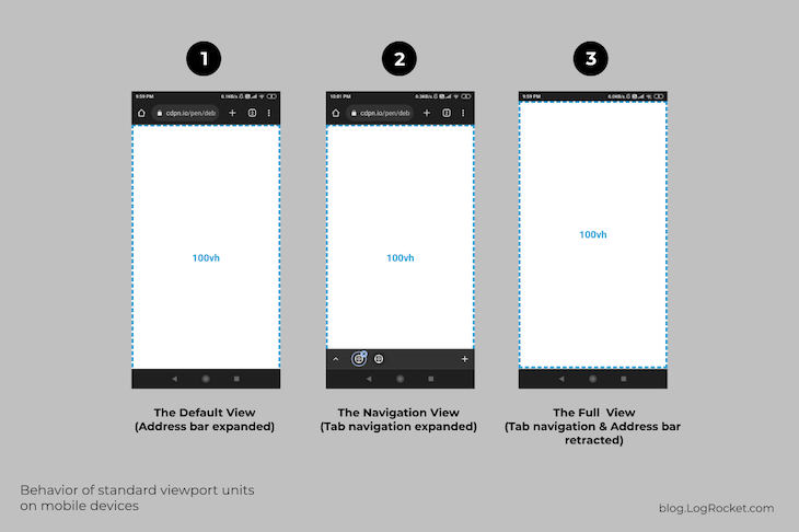
In the first state or default view, the element sized at 100vh is taller than the available viewport because the address bar — a user interface element — is active and expanded.
In the second state, when both the address bar and the tab navigation are active and expanded, the 100vh element appears taller than the available viewport.
The third state shows that when both user interface elements are retracted after scrolling down the document a bit, the 100vh element fits perfectly within the entire viewport area.
By observing the three states mentioned above, it becomes clear that the top-level viewport units we discussed earlier do not take into account changes in the UA UI, which can cause issues if your application heavily relies on these units and is accessed primarily by mobile users.
You can use this CodePen demo provided to see for yourself that HTML elements sized with the vh unit do not adjust when UA UI elements expand or retract.
Different web browsers and mobile devices have different user interface features and elements. For example, Firefox for Android has a facility to move the address bar to the bottom, while Chrome and Opera have a tab navigation at the bottom.
With the ongoing experimentation and new additions to the UA UI, it’s becoming increasingly important to have more versatile viewport units that can adapt to these changes.
The need for new CSS viewport units
The latest set of CSS viewport units includes solutions for the layout inconsistencies on mobile devices caused by the units that were initially introduced. The older units can still be used in a global context; however, the new units are primarily modifiers that offer three different behaviors.
These units are smarter than the top-level ones, as they are more intuitive towards the UA UI changes. These units are divided into three categories — small, large, and dynamic. In this section, we will discuss these categories and provide examples to illustrate their usage.
I will use variations of the vertical unit — svh, lvh, and dvh — to illustrate the changes. This approach will make the distinctions between each viewport modifier unit more obvious and simpler to understand, given the top-down layout flow.
The other units function pretty similarly to their top-level counterparts, which we discussed above.
It is important to keep in mind that the different behaviors of these three units can only be seen on a mobile device. The most effective way to view the demos is to fork the corresponding pens and switch to the “debug” mode.
The small viewport unit
A small viewport unit, sv-, determines its size based on one percent of the viewport size after excluding the size of active UA UI elements. For example, the height of an HTML div set to 100svh is equal to the available viewport height minus the height of any active and expanded UA UI elements:
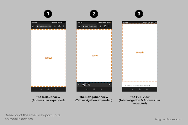
The third state in the figure above illustrates that the sv- set of units accounts for active UI elements when determining the size of a given HTML element.
However, it does not automatically adjust when UA UI elements expand or retract. Furthermore, the 100svh element fits perfectly in the viewport in the first and second states, as expected.
All the units with the prefix “sv” — svw, svh, svi, svb, svmin, and svmax — utilize the same method to determine the viewport-relative sizing.
These units are ideal for situations where you want to maintain a relative size to the viewport while also considering the active UA UI elements.
The large viewport unit
A large viewport size unit, lv-, calculates one percent of the viewport size without considering the state and size of UA UI elements, which is basically what the top-level viewport units do. See this unit in action below:
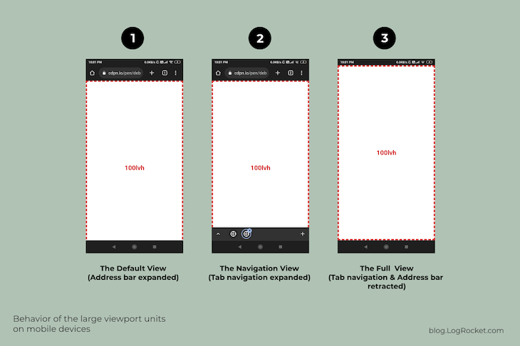
All units with the prefix “lv” — lvw, lvh, lvi, lvb, lvmin, and lvmax — are considered large viewport units. They function similarly to the top-level units discussed previously — vw, vh, vi, vb, vmin, and vmax — as none of them account for the browser UI when determining size.
Currently, there are limited situations where these units are useful, and it is uncertain if future updates will bring additional features to them.
Dynamic viewport units
A dynamic viewport size unit functions as a combination of large and small viewport units. Elements sized with these units automatically adjust when UA UI elements expand or retract, as you can see below:
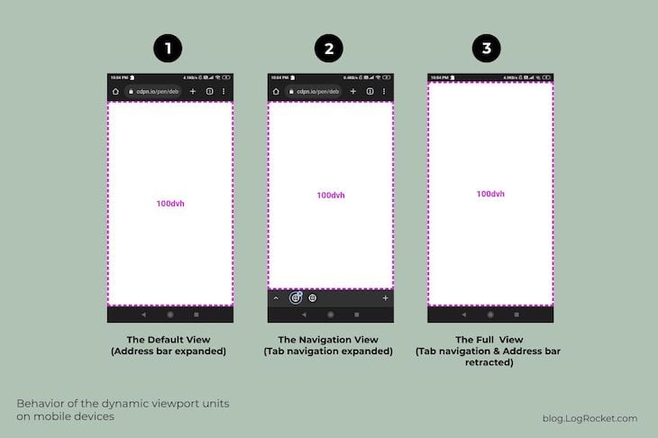
From the image above, it is clear that the dynamic set of viewport units is quite effective in terms of sizing HTML elements relative to the viewport. In each of the three states, the 100dvh element is fully visible in the viewport and fits the edges perfectly as expected.
This set of units is most useful when you want the elements to adjust and adapt automatically in response to the expanding or contracting user interface elements. In simple words, you can easily create those flexible and truly fullscreen hero sections with this particular unit.
Below is an example covering the same feature:
.hero-area {
  min-height: 100dvh;
  padding: 2em;
  ...
}
Check out the result in the CodePen below:
Compare the hero area pattern with its svh and lvh variations to observe the difference. Remember to use a mobile device to see the difference as previously mentioned.
Support for the latest CSS viewport units
These more recently introduced CSS viewport units have global browser support of 85 percent or more as of this publication. This indicates that they are widely supported and can be implemented with the option to fall back to the original set of units for older browsers.
Caveats regarding the latest CSS viewport units
Similar to the original set of CSS viewport units, the new units also do not take into account the scrollbar as a UA UI element.
This means if your page requires vertical scrolling, the scrollbar will be considered a viewport element and not a browser UI element. This will cause the horizontal viewport units to expand and a division with a width of 100vw will result in a horizontal scrollbar!
The same goes for the on-screen virtual keyboard; it is still not considered a user interface element and does not affect the viewport in any way. This can be beneficial for accessibility with long forms, but it can be confusing for shorter forms, as input elements are hidden instead of moving to the available viewport.
Also, the dynamic viewport values update at a slower rate and do not function at higher frame rates of 60fps and above. Some browsers also delay updates based on the gesture used — for example, slow scrolling, panning, or swiping.
Conclusion
We discussed the concept of the viewport and its viewport units with some of their practical applications. We also examined the challenges that these units present on mobile devices and introduced recent developments to address these issues, including three new viewport modifier units.
Additionally, we highlighted some limitations of these new units and discussed areas that have yet to be addressed, such as the treatment of scrollbars as a part of the viewport rather than the user interface.
With this information, you should now have a better understanding of which viewport units to use in your projects. If you have any further questions or want to share your thoughts, please feel free to reach out.


No comments:
Post a Comment