


Several CSS properties, including width, margin, padding, and font-size, require a length value, and CSS provides various methods to express length.
In CSS, a length is represented by a number followed by a unit, with no whitespace in between. Examples include 5px, 0.9em, and so forth.
CSS employs two main types of units for expressing length and size: absolute and relative.
Absolute Length Units
Absolute length units are derived from tangible physical units and are generally perceived as consistent in size across various devices. Nevertheless, exceptions may arise based on factors such as screen size, display quality, and configurations in your browser or operating system.
Here are some common absolute length units in CSS:
px
Pixels, or px, are one of the most common length units in CSS.
In CSS, 1 pixel is formally defined as 1/96 of an inch. All other absolute length units are based on this definition of a pixel.
But when that standard was originally formulated, most monitors had a resolution of 1024 x 768, and a DPI (dots per inch) of 96.
Screens on modern devices have much higher resolutions and DPIs, so a line that's 96 pixels long may not measure exactly 1 inch, depending on the device.
Even though sizing in pixels can vary across devices, it's generally considered better to use pixels for screens.
If you know that your page will be printed on a high quality printer, then you may consider using another unit like cm or mm.
cm
Centimeters.
In CSS, 1cm is roughly 37.8 pixels, or about 25.2/64 of an inch.
mm
Millimeters.
In CSS, 1mm is roughly 3.78 pixels, or 1/10th of a centimeter.
in
Inches.
In CSS, 1in is roughly 96 pixels, or about 2.54cm.
pt
Points.
In CSS, 1pt is roughly 1.3333 pixels, or 1/72th of an inch.
pc
Picas.
In CSS, 1pc is roughly 16 pixels, or 1/6 of an inch.
Relative Length Units
Relative length units are measurements that depend on the size or settings of another element. For instance, the relative font size of an element can be determined based on the font size of its parent element.
Here are some common relative length units:
em
The CSS em unit gets its name from a typographical unit. In typography, the term em "was originally a reference to the width of the capital M in the typeface and size being used".
When used with the font-size property, em inherits the font-size from its parent element:
.container {
  font-size: 16px;
}

.container p {
  font-size: 1em;
}

.container h2 {
  font-size: 3em;
}

.container h3 {
  font-size: 2em;
}
In this example, the font-size of p is 16px (16 * 1). Meanwhile, the font-size of h2 is 48px (16 * 3), and 32px for the h3 (16 * 2).
If em is used with another property like width, em is calculated using the size of the targeted element.
rem
Root em.
This relative unit is not affected by the size or setting of a parent
element, and is instead based on the root of the document. For websites,
the root of the document is the html element.
p {
  font-size: 1.25rem;
}
In most browsers, the default font size is 16, so the font-size of html elements is 16px. So in this case, p is 20px (16 * 1.25).
But if a user changes their browser's default font size, then the font-size of p will scale up or down accordingly.
%
Percentages, or the percent size relative to the parent's size:
div {
  width: 400px;
}

div p {
  width: 75%;
}
Since the parent’s width is 400px, the width of the inner paragraph is be 300px (400 * .75).
vw
View width. 1vw is 1% of the width of the viewport.
For example:
body {
  width: 100vw;
}
Since the body element is set to 100vw,
or 100% of the viewport's width, it will take up the full width
available to it. So if you resize your browser to 690 pixels wide, then
the body will take up all 690 pixels in width.
vh
View height. 1vh is 1% of the height of the viewport.
For example:
div {
  height: 50vh;
}
The div will fill 50% of the viewport's height. So if the browser window is 900 pixels high, the height of the div will be 450 pixels.
ex
The CSS ex unit gets its name from x-height in typography, or "the height of the letter x in the font". In many fonts, the lowercase x character is usually about half the height of the largest character.
In CSS, 1ex is the x-height of the font, or half of 1em.
But since the size of the lowercase x character can vary significantly based on the font, the CSS ex unit is rarely used.
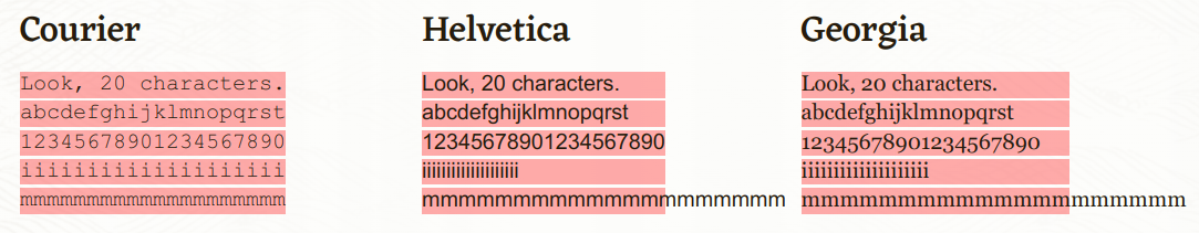
ch
Character unit. The CSS ch unit is defined as the width of the character 0 (zero, or U+0030) of the font.
While the ch
unit works as an exact measurement for monospaced / fixed width fonts
like Courier, it can be unpredictable with proportional fonts like
Arial.
For example, if your font is Courier and you set an element's width to 60ch, that element will be 60 exactly 60 characters wide.
But if your font is Arial and you set an element's width to 60ch there's no telling how wide the element will be – characters may overflow the container, or fall short.
Check out this article for an in-depth explanation of the ch unit, and to see some examples.
vmin and vmax
Viewport minimum (vmin) and viewport maximum (vmax) units are based on the values of vw and vh.
1vmin is 1% of the viewport's smallest dimension, and 1vmax is 1% of the viewports largest dimension.
For example, imagine a browser window that is 1200 pixels wide and 600 pixels high. In this case, 1vmin is 6px (1% of vh, which is smaller at 600 pixels). Meanwhile, 1vmax is 12px (1% of vh, which is the larger value at 1200 pixels).


No comments:
Post a Comment