Web developers use various UI elements to develop web application interfaces. In some scenarios, these include wizard-like flows with several steps, such as in web apps that let users make a reservation. Designers typically decompose the entire workflow into several steps, such as entering user details, making a payment, and receiving the booking confirmation. Then, they indicate the progress through the list of steps in a separate section. 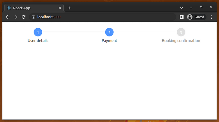
These steps-based flow indicators are known as stepper components. A stepper component typically visualizes several steps and indicates the current progress by highlighting already completed steps. A stepper component is usually responsible for displaying the workflow progress, so we often need to switch form segments programmatically.
In this tutorial, I’ll explain several ways to add stepper components to your React apps with practical examples.
Ways to implement a stepper component in React
In this section, we’ll check out the available stepper component development options and discuss when to use each!
Using a library for adding steppers is a good choice if you don’t use a fully-featured UI kit or don’t want to build a stepper widget from scratch. The following popular stepper libraries offer pre-developed, customizable React components:
Using react-stepper-horizontal
react-stepper-horizontal is a library that lets you create stepper components with a pre-developed, pre-styled Stepper
component. This npm module was initially released in 2016 and offers
several props to control the component behavior and styling.
This library’s GitHub repository doesn’t show much development activity, but it is highly usable in React apps because of its complete features and customizability.
Using react-form-stepper
react-form-stepper is an alternative to the react-stepper-horizontal library and offers a Material-inspired, pre-developed Stepper component for React developers. This library was released in 2019 and has an actively maintained GitHub repository.
This package offers almost all customization features, similar to the react-stepper-horizontal package. Additionally, it offers some modern features like HOC (higher-order components)-based step definitions.
Importing stepper components from UI kits
Many React developers use UI kits to develop their apps because UI kits offer all the generic components they need, so they don’t need to look for multiple-dependency libraries. Popular React UI kits like MUI, React Bootstrap, or Prime React offer pre-developed stepper components, so we don’t need to install a dedicated stepper library if we use a fully-featured UI kit.
If you are looking for a stepper component for your React app, you can use the stepper components from popular React UI kits like MUI, KendoReact, or React Bootstrap. These UI kits offer beautiful, fully-featured stepper components that can be customized according to your needs.
Building a stepper component from scratch
External packages increase your app bundle size (you can calculate this using BundlePhobia), so adding a third-party package for every development requirement isn’t always a good choice. Also, third-party packages may not completely fulfill your design requirements and may bring features that you don’t even use. Writing your own stepper component is also an option by including only the required features.
Let’s start creating stepper components with the above methods!
Creating stepper components with react-stepper-horizontal
Now, let’s make our first stepper component with the react-stepper-horizontal package, which offers a customizable, pre-developed Stepper component. First, create a new React project with Create React App, as follows:
npx create-react-app react-steppers-demo
cd react-steppers-demo
Next, install the stepper component library:
npm install react-stepper-horizontal
# --- or ---
yarn add react-stepper-horizontal
Creating a basic stepper component
Let’s create a basic stepper with this library. In this example,
we’ll visualize a fixed, pre-defined set of steps for demonstration
purposes. Add the following code to your App.js file:
import Stepper from 'react-stepper-horizontal';
import './App.css';

function App() {
  const steps = [
    { title: 'User details' },
    { title: 'Payment' },
    { title: 'Booking confirmation' },
  ];
  const activeStep = 1;

  return (
    <div>
      <Stepper
        steps={steps}
        activeStep={activeStep}/>
    </div>
  );
}

export default App;
Run your app and check the web browser. You’ll see a pre-styled
stepper component with three steps, as we defined in the source file:  Here, we rendered a basic stepper by providing three steps via the
 steps prop and highlighting the finished steps by setting the activeStep prop. Steps one and two are marked as done because activeStep is 1 (index 1 refers to the second element, since the index starts from 0).
Using dynamic sections with the stepper component
Now we can dynamically switch form segments based on the active step
to make the app more interactive. Use the following code in your App.js file:
import React, { useState } from 'react';
import Stepper from 'react-stepper-horizontal';
import './App.css';

function UserDetails() {
  return <h2>User details</h2>;
}

function Payment() {
  return <h2>Payment information</h2>;
}

function Confirmation() {
  return <h2>Booking is confirmed</h2>;
}

function App() {
  const [ activeStep, setActiveStep ] = useState(0);

  const steps = [
    { title: 'User details' },
    { title: 'Payment' },
    { title: 'Booking confirmation' },
  ];

  function getSectionComponent() {
    switch(activeStep) {
      case 0: return <UserDetails/>;
      case 1: return <Payment/>;
      case 2: return <Confirmation/>;
      default: return null;
    }
  }

  return (
    <div>
      <Stepper
        steps={steps}
        activeStep={activeStep}/>
      <div style={{padding: '20px'}}>
        { getSectionComponent()  }
        { (activeStep !== 0 && activeStep !== steps.length - 1)
            && <button onClick={ () => setActiveStep(activeStep - 1) }>Previous</button>
        }
        { activeStep !== steps.length - 1
          && <button onClick={ () => setActiveStep(activeStep + 1) }>Next</button>
        }
      </div>
    </div>
  );
}

export default App;
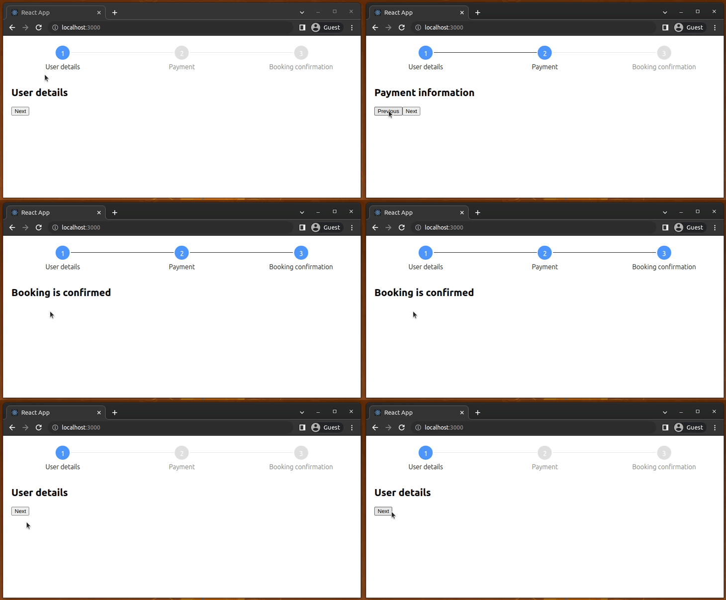
Here, we store the current step index with the activeStep state field and use the setActiveStep function to change the current step. The getSectionComponent function helps us to render a form component based on the current step.
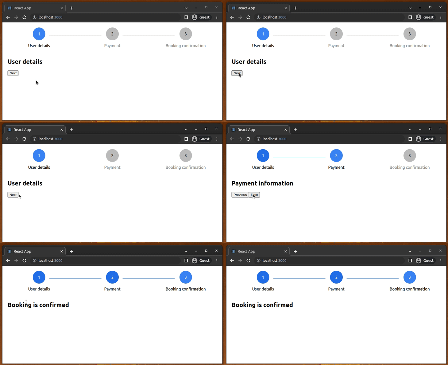
Users can switch steps by clicking on the next and previous buttons. Look at the following preview:
This library lets you attach click handlers to each step. For
example, the following setup helps you navigate between steps by
clicking the completed steps:
const steps = [
  { title: 'User details', onClick: () => setActiveStep(0) },
  { title: 'Payment', onClick: () => setActiveStep(1) },
  { title: 'Booking confirmation', onClick: () => setActiveStep(2) },
];
Customizing styles
In the previous example, we didn’t use any custom styles for the stepper component, so the library used the default blue color appearance for the stepper component.
The Stepper component accepts several props for style
configuration. Let’s use those props and customize styles in the stepper
component. We’ll create a dark-color theme for our sample app.
First, activate the dark-color theme by adding the following CSS into your App.css:
.container {
  height: 100vh;
  background: #111;
  color: #eee;
}
Next, implement a new wrapper component for the customized step and use it as follows in App.js:
function CustomStepper(props) {
  return (
    <Stepper
      { ...props }
      activeColor="#ffd813"
      defaultColor="#eee"
      completeColor="#ffbd13"
      activeTitleColor="#fff"
      completeTitleColor="#eee"
      defaultTitleColor="#bbb"
      circleFontColor="#000"
      completeBarColor="#ffbd13"/>
  );
}

function App() {
  const [ activeStep, setActiveStep ] = useState(0);

  const steps = [
    { title: 'User details' },
    { title: 'Payment' },
    { title: 'Booking confirmation' },
  ];

  function getSectionComponent() {
    switch(activeStep) {
      case 0: return <UserDetails/>;
      case 1: return <Payment/>;
      case 2: return <Confirmation/>;
      default: return null;
    }
  }

  return (
    <div className="container">
      <CustomStepper
        steps={steps}
        activeStep={activeStep}/>
      <div style={{padding: '20px'}}>
        { getSectionComponent()  }
        { (activeStep !== 0 && activeStep !== steps.length - 1)
            && <button onClick={ () => setActiveStep(activeStep - 1) }>Previous</button>
        }
        { activeStep !== steps.length - 1
          && <button onClick={ () => setActiveStep(activeStep + 1) }>Next</button>
        }
      </div>
    </div>
  );
}
Here, we’ve created a custom stepper by setting various props in the CustomStepper component implementation:
<Stepper
  { ...props }
  activeColor="#ffd813"
  defaultColor="#eee"
  completeColor="#ffbd13"
  activeTitleColor="#fff"
  completeTitleColor="#eee"
  defaultTitleColor="#bbb"
  circleFontColor="#000"
  completeBarColor="#ffbd13"/>
Once you add the above code updates, you’ll see the following result:

Creating stepper components with react-form-stepper
The react-form-stepper package is a modern alternative to the react-stepper-horizontal package. Its API is more structured than the react-stepper-horizontal package, but offers almost the same feature set.
Let’s get started by installing the new library as follows on the same React project we’ve used before:
npm install react-form-stepper
# --- or ---
yarn add react-form-stepper
Next, add the following code to your App.js file to create a basic stepper. Make sure to remove the dark theme CSS from your App.css:
import { Stepper } from 'react-form-stepper';
import './App.css';

function App() {
  const steps = [
    { label: 'User details' },
    { label: 'Payment' },
    { label: 'Booking confirmation' },
  ];
  const activeStep = 1;

  return (
    <div>
      <Stepper
        steps={steps}
        activeStep={activeStep}/>
    </div>
  );
}

export default App;
We’ve created a read-only, static stepper component by using the steps and activeStep props.
Run the app. You’ll see a stepper component with a default, Material-like styling, as shown in the following preview: 
This library offers another coding style for constructing stepper
components. For example, we can create the previous stepper in the
following way:
import { Stepper, Step } from 'react-form-stepper';
import './App.css';

function App() {
  const activeStep = 1;

  return (
    <div>
      <Stepper
        activeStep={activeStep}>
        <Step label="User details"/>
        <Step label="Payment"/>
        <Step label="Booking confirmation"/>
      </Stepper>
    </div>
  );
}

export default App;
Here, we used Stepper, a Higher-Order Component (HOC), and Step components as children. You can use either the steps prop or the HOC coding style according to your preference.
Using dynamic sections with the stepper component
We can dynamically switch form components based on the active step to
make the app more interactive. Use the following code in your App.js file:
import React, { useState } from 'react';
import { Stepper } from 'react-form-stepper';
import './App.css';

function UserDetails() {
  return <h2>User details</h2>;
}

function Payment() {
  return <h2>Payment information</h2>;
}

function Confirmation() {
  return <h2>Booking is confirmed</h2>;
}

function App() {
  const [ activeStep, setActiveStep ] = useState(0);

  const steps = [
    { label: 'User details' },
    { label: 'Payment' },
    { label: 'Booking confirmation' },
  ];

  function getSectionComponent() {
    switch(activeStep) {
      case 0: return <UserDetails/>;
      case 1: return <Payment/>;
      case 2: return <Confirmation/>;
      default: return null;
    }
  }

  return (
    <div>
      <Stepper
        steps={steps}
        activeStep={activeStep}/>
      <div style={{padding: '20px'}}>
        { getSectionComponent()  }
        { (activeStep !== 0 && activeStep !== steps.length - 1)
            && <button onClick={ () => setActiveStep(activeStep - 1) }>Previous</button>
        }
        { activeStep !== steps.length - 1
          && <button onClick={ () => setActiveStep(activeStep + 1) }>Next</button>
        }
      </div>
    </div>
  );
}

export default App;
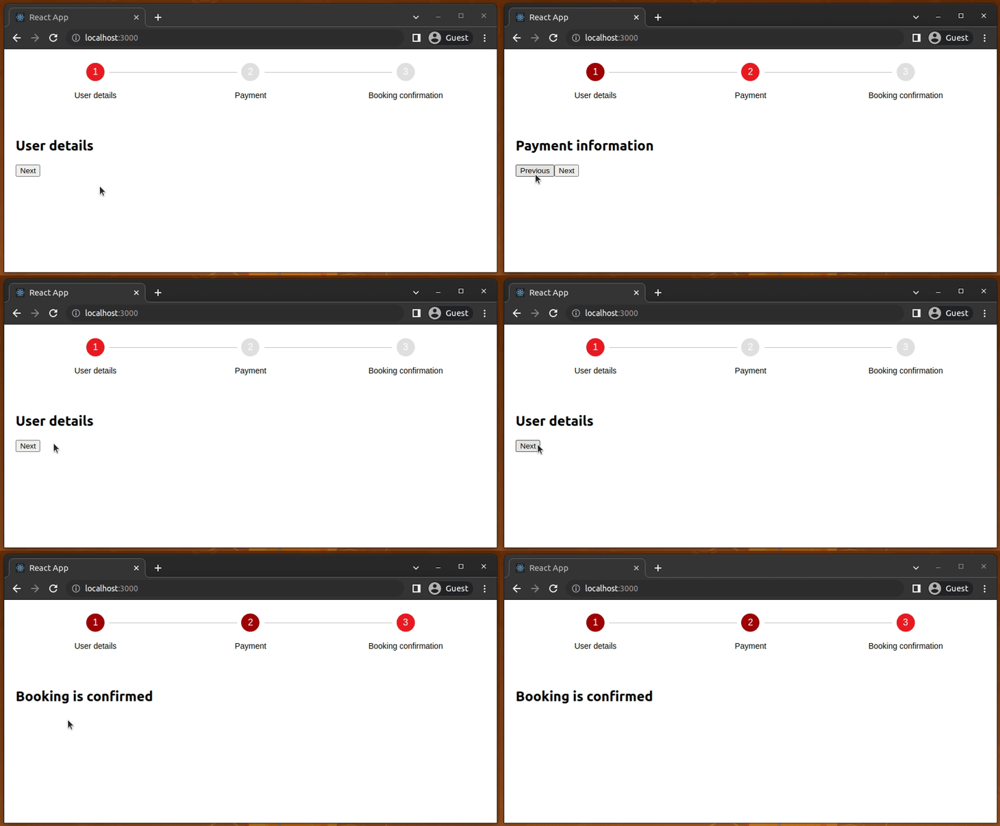
The above code implements navigation buttons to switch the active step as we implemented for the react-stepper-horizontal example before. The above code will work as follows:
You can attach a click handler to each completed step node, and enable navigation support in the stepper component as follows:
const steps = [
  { label: 'User details', onClick: () => setActiveStep(0) },
  { label: 'Payment', onClick: () => setActiveStep(1) },
  { label: 'Booking confirmation', onClick: () => setActiveStep(2) },
];
Creating custom styles
Earlier, the library rendered a default stepper component because we didn’t apply custom styles. This library lets you customize the component appearance via props. Let’s check the supported styling props by implementing a dark-color theme.
First, activate a dark-color theme by using the following CSS in your App.css:
.container {
  height: 100vh;
  background: #111;
  color: #eee;
}
Next, use the following component implementations in your App.js file:
function CustomStepper(props) {
  return (
    <Stepper
      { ...props }
      connectorStateColors={true}
      connectorStyleConfig={{
        completedColor: '#ffbd13',
        activeColor: '#ffbd13',
        disabledColor: '#eee'
      }}
      styleConfig={{
        activeBgColor: '#ffd813',
        completedBgColor: '#ffbd13',
        inactiveBgColor: '#eee',
        activeTextColor: '#111',
        completedTextColor: '#222',
        inactiveTextColor: '#444'
      }}
      />
  );
}

function App() {
  const [ activeStep, setActiveStep ] = useState(0);

  const steps = [
    { label: 'User details' },
    { label: 'Payment' },
    { label: 'Booking confirmation' },
  ];

  function getSectionComponent() {
    switch(activeStep) {
      case 0: return <UserDetails/>;
      case 1: return <Payment/>;
      case 2: return <Confirmation/>;
      default: return null;
    }
  }

  return (
    <div className="container">
      <CustomStepper
        steps={steps}
        activeStep={activeStep}/>
      <div style={{padding: '20px'}}>
        { getSectionComponent()  }
        { (activeStep !== 0 && activeStep !== steps.length - 1)
            && <button onClick={ () => setActiveStep(activeStep - 1) }>Previous</button>
        }
        { activeStep !== steps.length - 1
          && <button onClick={ () => setActiveStep(activeStep + 1) }>Next</button>
        }
      </div>
    </div>
  );
}
The above code implements a custom, dark-theme-ready stepper component via the CustomStepper wrapper component. Run your app and check the web browser. You’ll see a custom stepper component as follows:
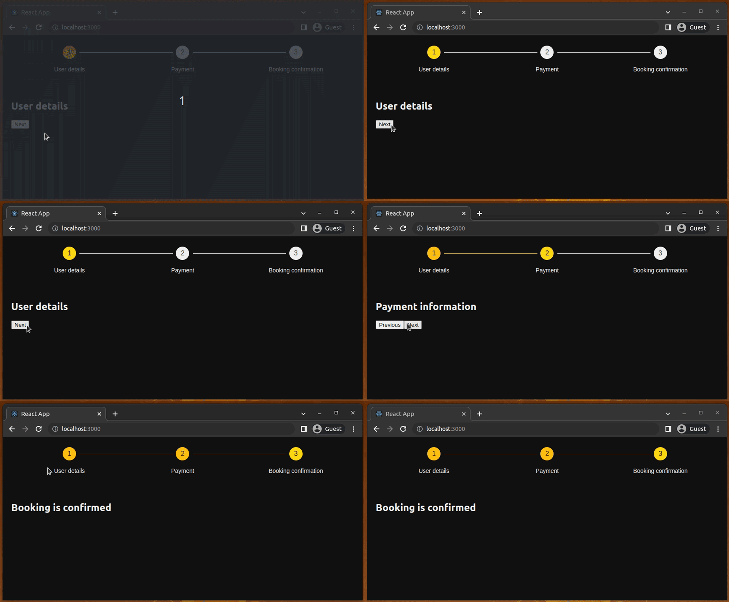
This library lets you customize the node connectors’ thickness, node border-radius, and node content via component props. See all supported props from the official API documentation.
Using stepper components from UI kits
Popular React UI kits like MUI, React Bootstrap, or Prime React offer pre-developed stepper components, so you don’t need to install a dedicated stepper library if you use a fully-featured UI kit:
MUI
MUI offers the Stepper component for adding steppers to your React apps. The MUI stepper offers the following step and stepper types:
- Types of steps: editable, non-editable, mobile, optional
- Types of steppers: horizontal, vertical, linear, non-linear
MUI stepper comes with several sub-components and props for customization purposes. You can check the official API documentation to learn more. You can also see a live demo on CodeSandbox:
Prime React
Prime React offers the Steps component
for creating stepper components. It provides a basic stepper component
and an interactive one where users can navigate among steps by clicking
on each node. It also comes with various props for customization
purposes.
You can browse API documentation from the official website and see this component live on CodeSandbox:
Creating a stepper component from scratch
If you need a minimal stepper, you don’t need to migrate to a large React UI kit or use a fully-featured stepper component library. Creating a shareable, minimal stepper component with React Hooks and some CSS is so easy and not so time-consuming.
I added this example’s source into a GitHub repository, so you can clone it into your computer to get started:
git clone https://github.com/codezri/react-stepper-minimal.git
Install dependencies with the following command:
npm install
# --- or ---
yarn install
Next, run the React app and see it on your web browser:
npm start
# --- or ---
yarn start
Once you run the app, you’ll see the following result:
This minimal stepper component has the following features:
- Accepts
stepsas a string array andactiveStepas an integer for rendering the stepper component based on arbitrary steps - Renders indices in circles based on steps and indicates completed, current, and inactive steps, with different styles accordingly
- Renders and styles connector lines based on the current step
- Changes the width and node positions adaptively according to the device resolution
Let’s understand how it works.
Look at the Stepper component implementation below. It constructs the step elements from the steps prop as follows:
steps.map((label, index) =>
  <div className={getStepClasses(index)} key={index}>
    <div><div className="circle">{index + 1}</div></div>
    <div className="label">{label}</div>
    { index < steps.length - 1 && <div className="line"></div> }
  </div>
)
We used the getStepClass function to dynamically set a
CSS class to style steps based on the active step. For example, if a
particular step’s index is the active step index, we use the step-active CSS class:
function getStepClasses(step) {
  let cls = 'step';
  if(activeStep === step) {
    cls += ' step-active';
  }
// ----
Each step element has a circle with the step number, label, and connector line. In App.css, we’ve styled these as divs:
/* ---- */
.step-done .circle {
  background: #236ee8;
  color: #eee;
}

.step-inactive .circle {
  background: #bbb;
  color: #000;
}

.step-active .label {
  color: #000;
}
/* ---- */
This stepper component is so minimal and implements all the basic
features that a generic web app needs. You can copy-paste this
implementation and extend it as you wish. If your step element rendering
logic grows complex, you can refactor the Stepper component by separating step-related code into a new component called Step.
Conclusion
In this tutorial, we discussed several available methods for creating stepper components in React apps. You can use the react-progress-stepper package to create animated steppers with progress bars, or react-stepper-js for a minimal pre-developed stepper component.
If you want to implement your own stepper for your project and publish it to the npm registry as an open-source project for other developers to use, that's also a great idea. Importing a stepper component from a popular UI kit is another productive approach.
It's important to adhere to UI/UX principles while adding stepper components to your apps regardless of your stepper component creation method (library, UI kit, or from scratch). For example, make sure that steppers render accordingly on different screen resolutions, use text colors that don’t blend with backgrounds, and match stepper colors with your global app theme.
I hope this helps! Let me know if you have any other questions.


No comments:
Post a Comment